The release of JEB 2.1.2 is being distributed to our customers today and tomorrow. We thought it would be a good time to present/recap some of the UI changes that were introduced since version 2.1.
Layouts
The RCP client comes with a default layout that has the Project view on the left-hand side, the Logger and Console at the bottom, and a large empty workspace area in the center. The layout can (and should!) be customized to fit your analysis needs.
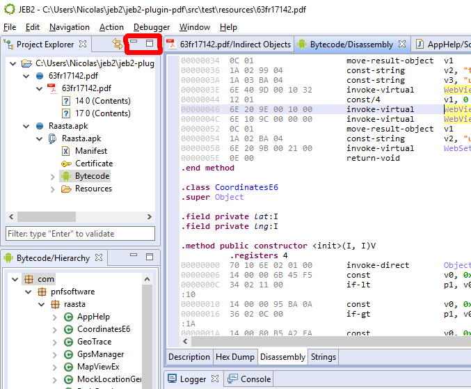
Drag views around by their title areas. Expand a view to full-screen by double clicking on its title area. Minimize or maximize view groups using the icons located in the view trimbar. (Circled in red in the picture below.)

Since you may want to have different layouts for different use cases, layouts can be duplicated and customized. You can achieve this via the Window/New Layout… menu option.
Auto-sync the Project tree selection
Enable this feature via the double-arrow icon located in the Project Explorer view. (As seen on the picture below.) When enabled, the simple selection of a unit element in the tree will automatically bring up the associated unit view. No need for Enter, no need for double-click: a simple selection is enough.
This option is especially useful when navigating large swarm of resource files, eg pictures.
Open same-type unit in same views
When enabled, a unit of view X will be opened in an already existing view representing another unit of the same type (X).
This option is extremely useful when opening many views of the same type, but only the last one is important: example, when decompiling and navigating code.
Navigating a text view with a non-sticky caret
By default, the navigation of a text view in JEB2 may be a bit confusing: due to the way very large buffers are handled by these views, it is often more resource-efficient to keep the caret on its viewport location. That means that, upon scrolling up or down, the caret will visually remain where it is.
When highlighting interactive items, and wanting to keep track of other related items across the buffer, that default behavior is not ideal: it is better to maintain the caret position within the buffer, as opposed to within the viewport.
Use Control (Control on Mac) +Shift + Up|Down to keep the caret where it is when scrolling up/down.
More to come
We will keep this entry updated as we add more how-to and gotchas regarding the RCP client user interface. If you have questions or requests, feel free to email us at support@pnfsoftware.com.


